Website Design for Optimal PBS
Written by Peter Skitt, Creative Director of Buzz Design
Optimal PBS is a recruitment and HR company with a clear and ambitious brief: a website that broke from the typically conservative and undifferentiated aesthetic of the recruitment sector. The vision was for a vibrant, engaging site that would resonate with both job seekers and employers, and demonstrate that Optimal PBS approached recruitment and HR differently to the competition.
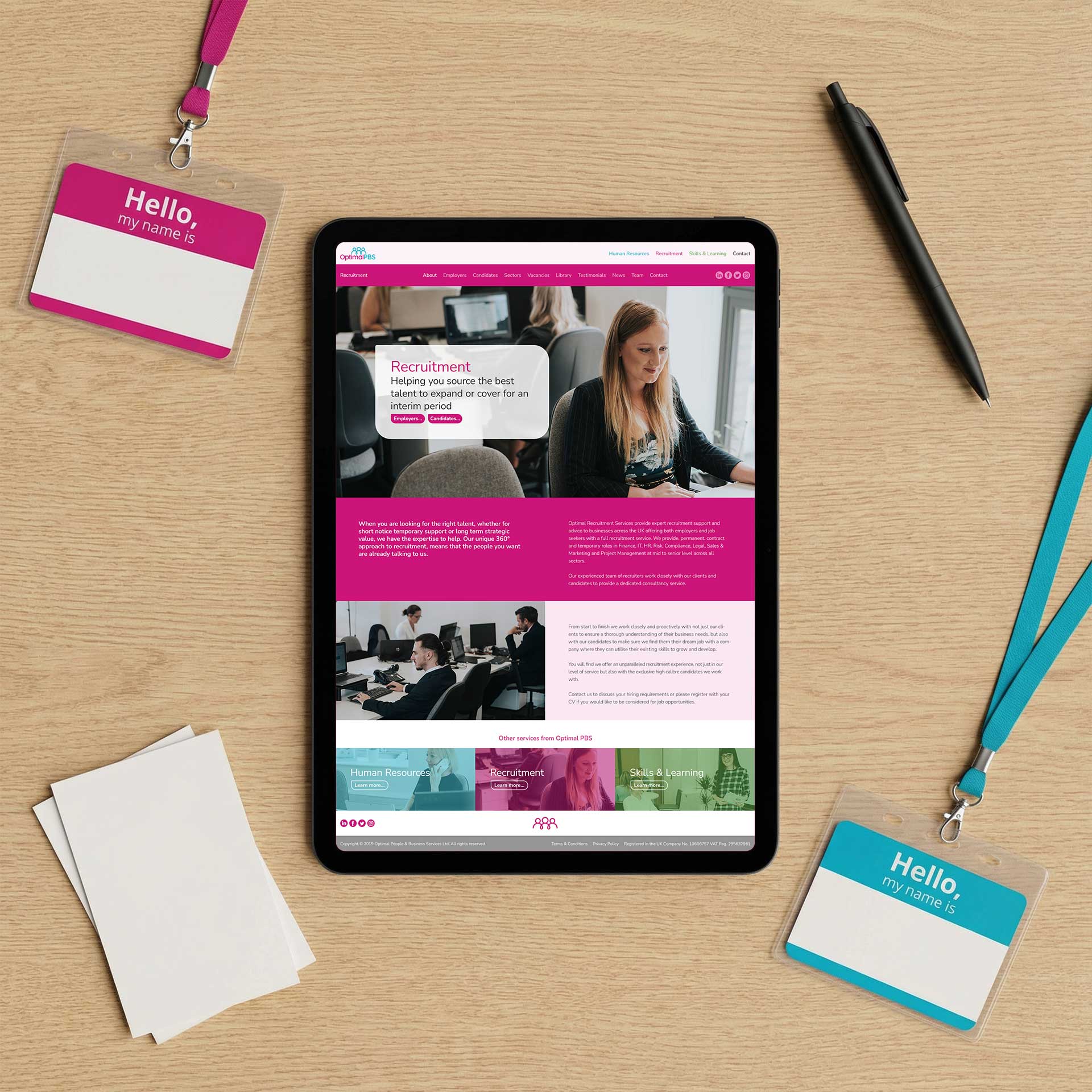
We developed a strategic colour palette to differentiate the company’s three service areas — Recruitment, HR, and Training — with distinct content pathways for each of the two primary audiences the business serves.
Challenges
Most recruitment websites look the same: professional photography of confident-looking people in open-plan offices, and service descriptions that could have been written for any agency in the sector. Standing out in this environment requires genuine design courage, not incremental refinement.
Serving two very different audiences; job seekers looking for their next role, and businesses seeking recruitment and HR solutions, within a single cohesive site is a structural challenge. The wrong architecture produces a site that satisfies neither group.
Colour-coding three service areas in a way that feels coherent rather than chaotic required a palette that was strategically planned from the start, not assembled as the design evolved.
Design Process
Research into recruitment and HR website conventions identified where the sector consistently failed to differentiate itself, and where genuine visual and structural contrast was achievable. The colour palette was developed specifically to distinguish Recruitment, HR, and Training with clarity and consistency — not as a cosmetic decision, but as a navigational strategy.
Content sections were written and structured for each of the two primary audiences, with distinct information priorities for job seekers and employer clients. Team profiles, success stories, and client testimonials were integrated to build authority with both groups.
Navigation was designed for simplicity and speed. A visitor who cannot find their relevant section quickly will leave rather than search — and in recruitment, a visitor who leaves is a potential candidate or client lost.
Solutions
The website uses a strategic colour palette differentiating Recruitment, HR, and Training visually, with separate content pathways structured for candidates and employer clients. Team profiles and testimonials build credibility across both audiences.
Intuitive navigation across all service areas and SEO-optimised content throughout support visibility for hiring-related and job-seeking searches. The site successfully positions Optimal PBS as a differentiated alternative to the generic recruitment agency presentation.
Results
Optimal PBS launched with a website that broke clearly from the sector norm and gave the business a genuinely distinctive digital presence. The colour-coded service structure has made the site significantly more navigable for visitors arriving with a specific need.
The two-audience content approach has given both job seekers and employer clients a site that feels relevant to them — an outcome that is rarer in recruitment websites than it should be.
Lessons Learned
Differentiation in a commoditised sector is not simply a visual exercise. The design can only do so much; the content and structure have to genuinely serve distinct audiences differently, or the visual differentiation is decoration on a site that still functions the same as everyone else’s.
Colour-coding service areas works well — but only when the palette is planned with discipline and the distinction between areas is immediately clear. Ambiguity in a colour-coded navigation system defeats the purpose entirely.
Recruitment websites that genuinely serve both candidates and employers are rare. Most lean toward one audience and leave the other feeling that the site was not really built for them. Getting both right, in a single coherent experience, is the real design challenge.
Start your web design project today
If you’re thinking about a new website, or you know your current one isn’t doing the job it should, let’s talk. Call us, email us, WhatsApp us, or fill in this form and we’ll get back to you shortly.