Website Design for Milek & Co
Written by Peter Skitt, Creative Director of Buzz Design
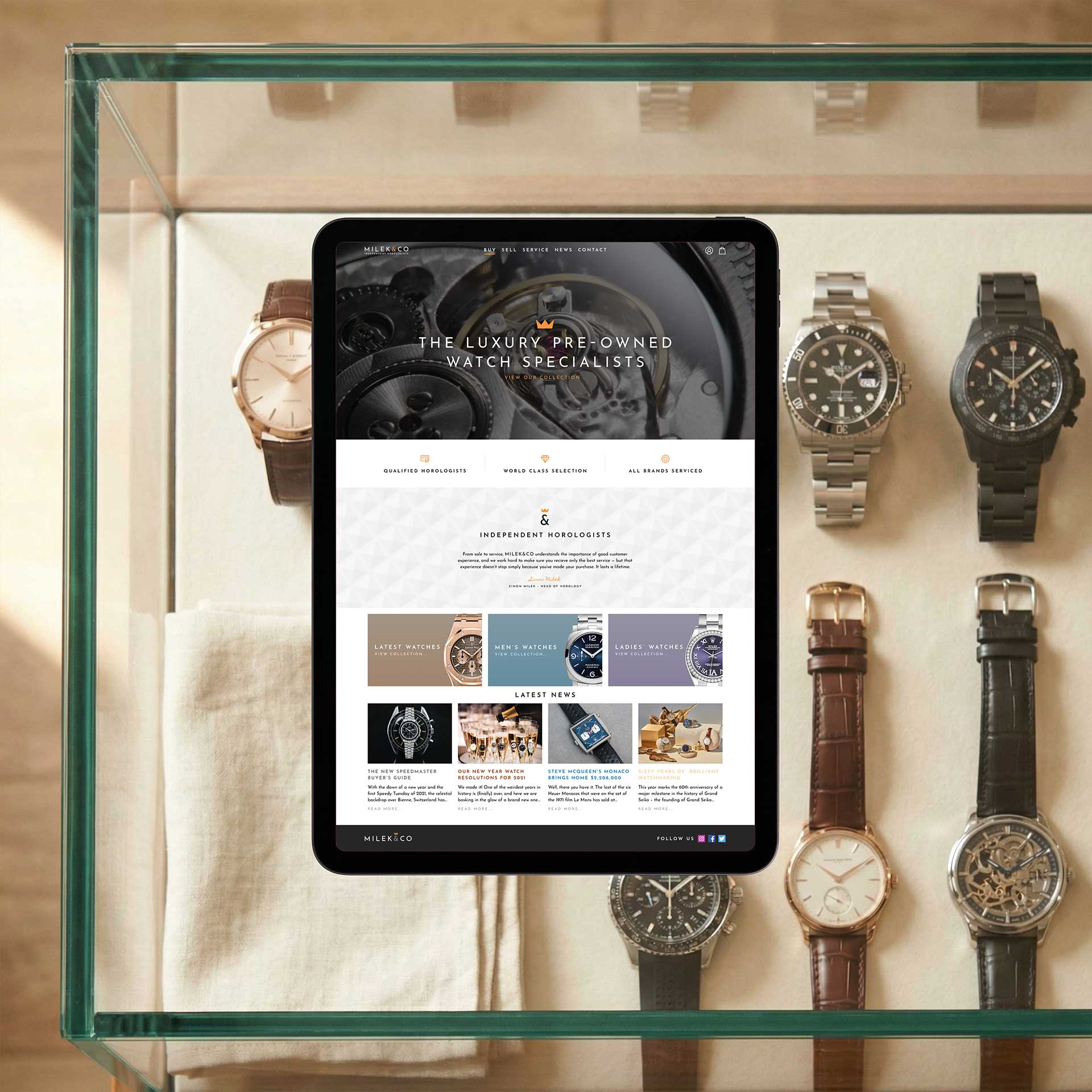
Milek & Co is an independent horologist company specialising in crafting and servicing high-end timepieces. The brief was for a website that would capture the luxury and precision of the watchmaking world while showcasing the company’s craftsmanship with the depth and sophistication its clients expect.
This is a sector where the website is judged at the same standard as the product. A timepiece collector assessing Milek & Co through their digital presence will notice typographic choices, image quality, and spatial composition in the same way they notice the finishing on a dial. Every detail had to be intentional.
Challenges
High-end watchmaking presents a specific creative challenge: the product is inherently tactile, and communicating the quality of handcraft through photography requires exceptional image quality and precise creative direction. Without both, the photography detracts from credibility rather than building it.
The luxury audience is discerning and familiar with high-quality design. A website that looks generically professional will not engage them; it must feel genuinely considered at every level — typography, whitespace, texture, image treatment, and the tone of every line of copy.
Balancing the product showcase with the service capability — watchmaking alongside watch servicing — required a structure that gave appropriate weight to both without letting one overshadow the other.
Design Process
Design research into established luxury watch brands informed an understanding of the visual conventions of the sector and more usefully, where the opportunities for a distinctive independent horologist lay in relation to those conventions.
A typographic system was developed combining a classic serif with a clean contemporary face, reflecting the intersection of heritage craftsmanship and modern precision that defines high-end independent watchmaking.
Subtle textural elements referencing watch dials and case finishing were integrated into the layout as recurring graphic details. High-resolution product photography was used as the primary visual content across all key pages, with the layout designed to step back and allow the imagery to lead. Copy was kept precise and measured — communicating watchmaking and servicing capability without the promotional tone that would feel wrong in a luxury context.
Solutions
The finished website features a sophisticated visual design with rich product photography, a carefully composed typographic system, and subtle textural detail referencing the materials and finishing of the watches themselves.
Watchmaking and servicing capability is clearly presented alongside the product showcase, with calls to action written to invite enquiry without feeling promotional. Navigation is clean and intuitive, keeping the focus on the work.
Results
Milek & Co launched with a website that reflects the quality of the timepieces it represents. The design successfully navigates the balance between heritage and modernity that defines independent watchmaking at the highest level.
The site provides a credible and distinctive digital presence for the business, giving both new and existing clients a way to explore the company’s capability and craft before making contact.
Lessons Learned
In luxury, restraint is a design skill. Knowing what not to include — which features to omit, which copy to cut, which design elements to strip back — matters as much as knowing what to put in. A crowded luxury site signals that someone did not know when to stop.
High-resolution photography is the single most important investment a craft-based luxury business can make in its digital presence. It cannot be substituted, approximated, or compensated for with clever design. If the photography is wrong, nothing else can save it.
A discerning audience notices design details that most visitors never register. They will notice a poorly chosen font, an inconsistency in spacing, or a colour combination that does not quite work. These details are not cosmetic in the luxury sector — they are credibility signals.
Start your web design project today
If you’re thinking about a new website, or you know your current one isn’t doing the job it should, let’s talk. Call us, email us, WhatsApp us, or fill in this form and we’ll get back to you shortly.