Website Redesign for LRES-UK
Written by Peter Skitt, Creative Director of Buzz Design
LRES-UK is a family-run industrial cleaning and site services company with a strong reputation across diverse commercial and industrial settings. This is the second website Buzz Design has built for the business over a long working relationship — a partnership that has also included branding work and social media management, making Buzz Design an embedded part of the business’s marketing and communications.
When LRES-UK returned to Buzz Design for a new site, the brief was to produce something that reflected how far the business had grown since the first site. Not simply a refresh, but a step forward in the company’s digital presence.
Challenges
Industrial cleaning and site services is not a sector that lends itself easily to visually engaging web design. The challenge was to communicate professional excellence and operational expertise in a way that felt polished and credible, rather than utilitarian.
The service range is broad and varied. Without clear visual navigation, visitors can struggle to identify the specific services relevant to their needs — particularly if they arrive from a search rather than a referral and do not already know what the business offers.
The client needed to manage and update their own content without technical support. The CMS configuration had to make this genuinely effortless for a team whose primary focus is operational delivery, not digital administration.
Design Process
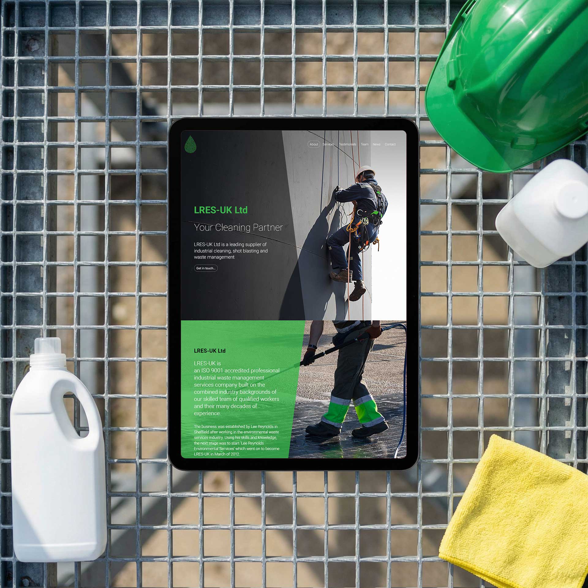
The brand refresh developed for this project was built around the bold green colour scheme that had established strong recognition for LRES-UK. The green was retained and developed — given more consistency and visual discipline — rather than replaced. This decision was deliberate: brand recognition built over years has commercial value, and refreshing is a more profitable exercise than rebuilding from scratch.
Icon-led navigation was designed to replace text-heavy service sections, allowing visitors to identify relevant services visually and immediately. Each icon was developed to be clear and distinctive enough to work as the primary navigation aid for its service category, not just as decoration alongside a text description.
WordPress CMS was selected and configured for easy client-side content management. Social media strategy was developed in parallel to ensure a consistent brand message across all channels from launch.
Solutions
The website features bold green branding applied consistently throughout, icon-led navigation enabling fast service identification, and clear service descriptions covering the full LRES-UK portfolio.
WordPress CMS allows the LRES-UK team to manage their own content, with a fully responsive layout across all devices. Social media management provides ongoing brand visibility across platforms.
Results
LRES-UK launched its second Buzz Design website with a significantly stronger visual identity and navigational clarity than the previous site. The client has managed their own content since launch, and the brand refresh has been well received across the business’s existing client base.
The combination of icon-led navigation and a refreshed, more disciplined green brand system has made the site more effective for visitors arriving with a specific service need in mind.
Lessons Learned
Iconography is particularly effective for service businesses with a wide range of offerings. It reduces cognitive load by letting visitors self-select visually rather than reading through a list — and a visitor who can find what they need quickly is a visitor who stays on the site.
Second websites for growing businesses should not simply be refreshes of the first. They should reflect how far the company has come — in scale, in credibility, and in the sophistication of what it now offers.
Brand and website work most effectively when developed together. A new website built around a brand that has not been reviewed produces a coherent result at the level of the old brand, not the level the business has reached.
Start your web design project today
If you’re thinking about a new website, or you know your current one isn’t doing the job it should, let’s talk. Call us, email us, WhatsApp us, or fill in this form and we’ll get back to you shortly.