Website Design for DJN Accountants
Written by Peter Skitt, Creative Director of Buzz Design
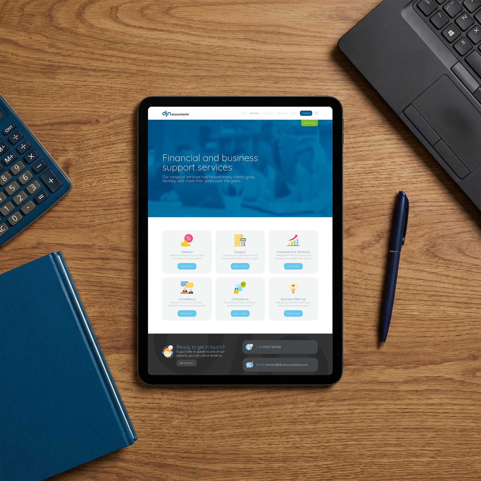
DJN Accountants is a forward-thinking accountancy firm delivering financial services to businesses of all sizes. Buzz Design was commissioned to create a website that departed from the conservative, largely interchangeable aesthetic of most accountancy firm websites using a strategic combination of colourful iconography and a purposefully applied green accent colour to create something visually engaging without sacrificing professional credibility.
Challenges
Accountancy websites operate within a narrow creative band: too conventional and the site disappears into a sector where most firms look identical; too adventurous and the design signals something other than the precision and reliability that accountancy clients expect. The brief required navigation of this tension with confidence and judgement.
A wide range of accounting services needed to be communicated clearly to business owners with varying levels of financial knowledge. The iconography had to work harder than decoration: it needed to actually differentiate services in a way that made navigation faster and more intuitive.
The green accent colour had to be used with strategic discipline. Applied everywhere, it becomes background noise; applied specifically to calls to action and key conversion points, it guides visitors in a measurable way.
Design Process
Research into accountancy website design identified conventions of the sector and where genuine differentiation was achievable without stepping outside the expectations of a professional financial services audience. An icon set was developed specifically for DJN Accountants — drawn for the business rather than selected from a stock library, so each icon carried the brand rather than borrowing a visual identity from a generic source.
Green was applied as a disciplined accent rather than a brand colour used throughout: appearing at calls to action, service enquiry pathways, and consultation entry points to guide visitors toward conversion without the visual noise of a green-dominant colour scheme.
Content was written to speak to business owners in language they would recognise from running a business, not from studying accountancy. The information hierarchy was built around the questions a business owner asks when they are looking for an accountant, not around the categories that make sense to the firm.
Solutions
The website uses a restrained and professional colour scheme with a purposeful green accent applied to key calls to action throughout. Custom-designed iconography differentiates each service area clearly, enabling fast navigation for business owners with a specific need.
Content is written for business owners rather than finance specialists, with an information hierarchy built around the questions a prospective client actually asks. The visual design maintains professional credibility while standing clearly apart from the sector norm.
Results
DJN Accountants launched with a website that stood clearly apart from its accountancy sector peers — a result that was both the goal of the brief and a genuine achievement given the creative constraints of the sector.
The iconography and colour system have made the site more navigable and more engaging than the conventional accountancy website presentation, while maintaining the professional credibility the sector demands.
Lessons Learned
In regulated, credibility-sensitive sectors, differentiation requires precision. Going too far loses the trust the sector depends on; not going far enough means disappearing into a sea of similar firms. The calibration between these two outcomes is where the real design skill lies.
Iconography works hardest when designed specifically for the business. A custom icon carries the brand; a stock icon carries a generic visual vocabulary that looks borrowed. In a sector as conservative as accountancy, the difference between the two is immediately visible to anyone looking carefully.
Colour as a navigational tool is more powerful than colour as decoration. A visitor who follows a green accent through a page to a consultation booking form has been guided. A visitor surrounded by green on every element of the page has simply seen a brand colour.
Start your web design project today
If you’re thinking about a new website, or you know your current one isn’t doing the job it should, let’s talk. Call us, email us, WhatsApp us, or fill in this form and we’ll get back to you shortly.