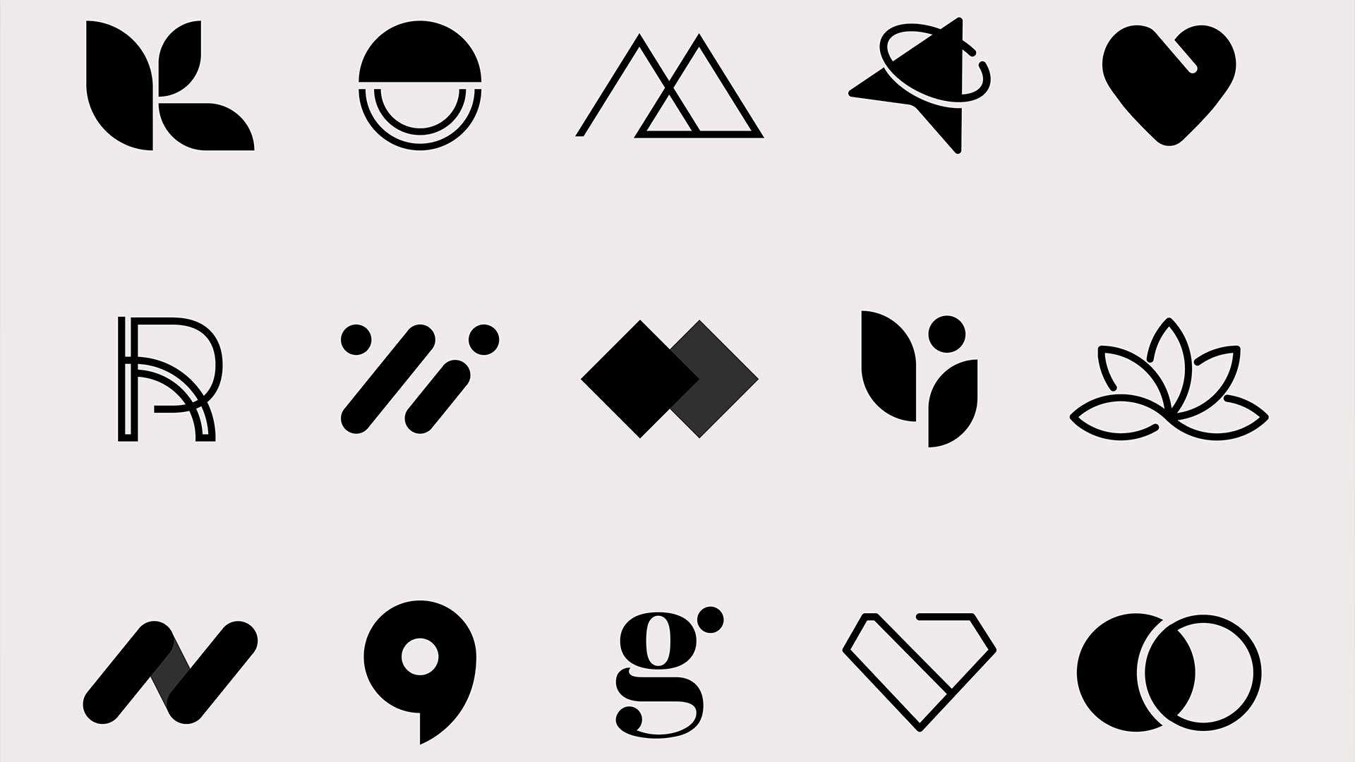
Your logo is often the first impression your business makes—so make it count. A strong logo isn’t just about looking good; it’s about creating a visual identity that communicates your values, makes you memorable, and helps you build trust with your audience. But with so many options out there, how do you choose the perfect logo design for your business?
At Buzz Design, we’ve helped businesses of all sizes avoid design pitfalls and create visuals that truly represent their brand. Below, we share 10 of the most common graphic design mistakes and how to avoid them.
😍 Know Your Brand Inside Out
Before thinking about fonts or colours, you need to clearly understand your brand identity. Ask yourself:
- What are your business’s values?
- Who is your ideal customer?
- What makes you different from your competitors?
This foundation will shape every design decision moving forward. A law firm might want a logo that’s elegant and trustworthy, while a children’s toy brand might go for something colourful and playful.
🧠 Keep It Simple, Make It Memorable
Some of the world’s most iconic logos—think Apple or Nike—are incredibly simple. A good logo should be:
- Easy to recognise at a glance
- Legible in different sizes
- Versatile across digital and print formats
Avoid cluttered designs and overly detailed graphics. Simplicity allows your logo to be timeless and flexible.
👍 Choose the Right Style
There are several types of logos, and each can say something different about your brand. The most common types include:
- Wordmarks (like Google): Clean and typography-focused
- Lettermarks (like IBM): Ideal for businesses with long names
- Pictorial marks (like Twitter): Icons or symbols
- Abstract logos (like Pepsi): Shapes not tied to anything recognisable
- Combination marks (like Adidas): Text + symbol
- Emblems (like Starbucks): Traditional, badge-style logos
Working with a designer can help you determine which style best suits your industry and brand personality.🙁 Low-Resolution Images
Blurry or pixelated images give the impression of low quality. Always use high-resolution images (300dpi for print, 72dpi for web) and ensure they are properly licensed for commercial use.
🎨 Consider Colour Psychology
Colour isn’t just decoration—it evokes emotion and influences how your brand is perceived. Some examples:
- Blue = Trust and professionalism (popular in tech and finance)
- Red = Energy and excitement (used in food and entertainment)
- Green = Growth and nature (great for eco or health-focused brands)
- Black = Luxury and sophistication
Keep in mind that your logo should also work in black and white for versatility.
🔮 Make It Future-Proof
Trendy logos can date quickly. Your logo should reflect your business today and grow with you. That doesn’t mean it can’t evolve over time (many famous logos do), but the core idea should remain solid and recognisable.
✅ Test It Across Formats
A good logo needs to look great everywhere—from your website and social media to business cards and branded merchandise. Make sure your design is scalable, readable, and visually balanced in all formats.

